

Sherwin-Williams colors often make it to the top of our picks for when you need to select a color that is both sophisticated and flexible.
In this ultimate guide, we’ll explore the most popular greige shades from Sherwin-Williams and break them down by unique undertones, best uses, and what makes each one special. This is your personal greige color cheat sheet and by the end you’ll be ready to make the best choice for your home.
Why Greige (Grey + Beige) Is the Perfect Neutral Color:
Greige is a perfect blend of gray and beige and has become a popular neutral color for its ability to be a perfect blend of gray and beige. It maintains a fine edge between the warmth of beige and the cooler lines of gray. It’s not too harsh or cold like pure gray, nor is it too soft or yellow like beige. Greige provides a middle ground between warm, deep, sophisticated and cool, bright, and clean. Thus, whether you want to go for a relaxing look or a modern, fresh one, greige is a popular useful design backdrop for your home.
Additionally, the complexity of greige is its beauty. A greige can be warm and inviting or cool and serene, depending on the lighting in your home, so you can change up your decor without fear of your walls clashing with your furniture or other color elements.
Agreeable Gray vs Accessible Beige vs Repose Gray vs Anew Gray vs Mindful Gray vs Balanced Beige vs Colonnade Gray vs Dorian Gray : A Comprehensive Comparison
After talking about why greige is such a popular neutral, let’s take a look at some of Sherwin-Williams’ most popular greige shades. In this post, we’ll look at their undertones, what kind of spaces they work best in, and how they’re different from the rest.
1. Agreeable Gray (SW 7029): The Crowd-Pleaser
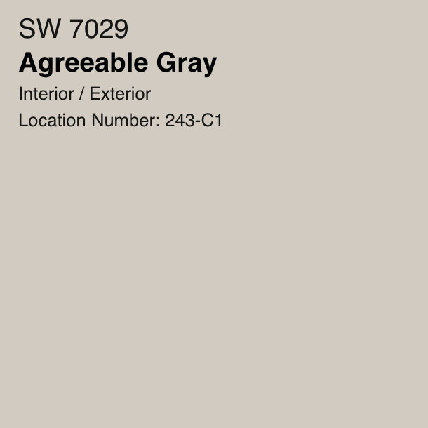
Agreeable Gray would be the absolute winner if there was a greige popularity contest. Well, it’s universally loved for a reason. This Agreable Gray being a warm greige feels inviting and cozy and leans more toward beige.
Undertones:
Agreeable Gray has very subtle green undertones, but they’re not striking enough to be agreeable and also not neutral. It’s often called the ‘safe choice’ because it goes with just about any decor style or color palette. Agreeable Gray is the paint for you, regardless if you want Modern minimalist or more traditional earthy.
Best For:
Areas with lots of natural light, open concept spaces, and living rooms. It’s a top pick for homes with traditional or transitional decor because of its warmth. In addition, it also works great in areas that require a sense of closeness — such as kitchen and dining rooms.
Why You’ll Love It:
If you’re looking for a neutral that doesn’t overpower the space, but still brings richness, Agreeable Gray is a foolproof choice. It’s a great choice for homeowners looking for a classic, versatile colour that will seamlessly blend into any setting. It provides a warm welcoming atmosphere for sit and relax kind of space.
2. Accessible Beige (SW 7036): The Warm Neutral
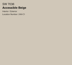
Accessible Beige is more neutral, warm greige that is a bit closer to beige which makes it feel cozy and friendly. If you’re not ready to commit to pure gray but don’t want to go with beige, Accessible Beige is the perfect middle ground.
Undertones:
Accessible Beige has a soft green undertone and it makes it feel earthy, grounded. It’s warm, but not too yellow, so it’s sophisticated and neutral.
Best For:
Any space that could use a bit of warmth and charm: family rooms, living rooms, kitchens. The warmth of the paint works really well with homes that have lots of natural wood in them.
Why You’ll Love It:
If you’re looking for a gentle hug for your walls, you got to go for Accessible Beige. By using this shade your rooms get wrapped around in a neutral tone of comfort that feels both fresh and familiar. At the same time, it doesn’t overpower with its warmth, and thus makes a relaxing environment for spending time with family and friends.
3. Repose Gray (SW 7015): The Cool Contemporary
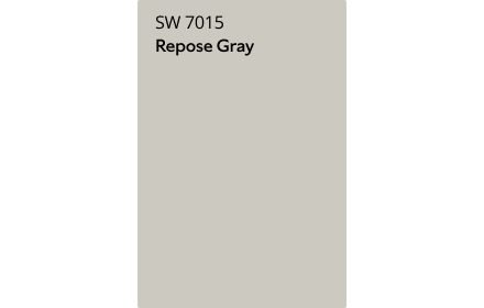
Repose Gray is a modern, cooler greige. This shade has a perfect balance of gray and beige with a cooler twist. Well, it’s a sophisticated choice for more modern spaces.
Undertones:
Subtle violet and blue undertones make Repose Gray a cool and peaceful shade. Additionally if you have cool lighting spaces, these undertones can become even more stronger thus creating a serene and calming effect.
Best For:
You could try this if you want a serene, peaceful atmosphere in your bedroom or office or any other space. Repose Gray also does well in a contemporary bathroom or kitchen, feeling slick and soft at the same time.
Why You’ll Love It:
If you want cooler tones but don’t want the harshness of a true gray, Repose Gray is a good choice. It’s elegant and modern, but warm enough to make you feel comfortable. Perfect for anyone looking to add a touch of sophistication to their space.
4. Anew Gray (SW 7030): The Balanced Greige
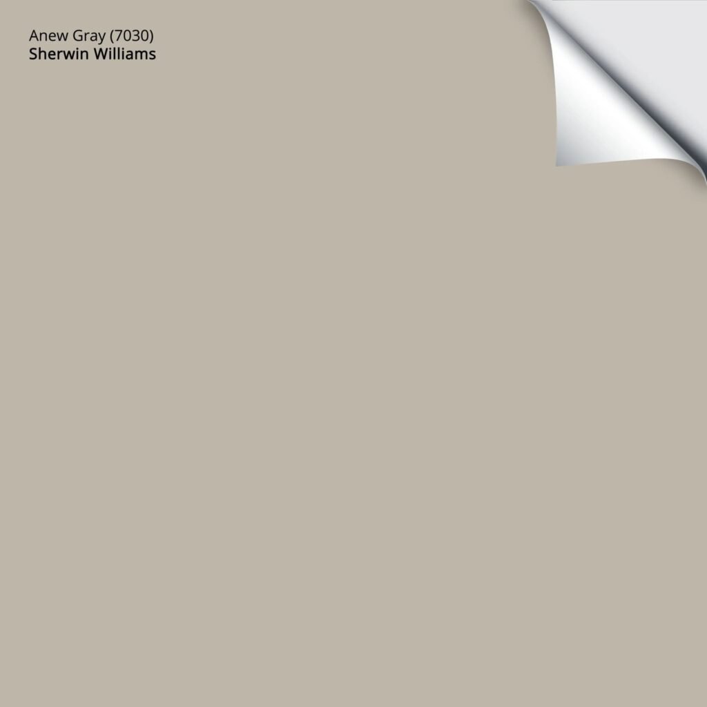
This Anew Gray strikes just the right balance between warm and cool tones and is a great one that pairs with almost any style. Its mid tone nature makes it feel cozy without being overbearing.
Undertones:
This greige has soft taupe undertones which subtly adds a touch of warmth without looking too beige. This is a greige that is neutral, but it can adapt to its surroundings, so it’s one of the more flexible greige choices.
Best For:
Hallways, formal dining rooms, or wherever you want a soft, neutral background that doesn’t take over the space. Whether you have a more traditional setting, or a modern space that calls for a grounded, timeless look, the style works very well.
Why You’ll Love It:
Anew gray feels effortless: warm without being too yellow, and neutral without being too cold. A reliable, well rounded color that will work in any room and is especially good at making a space feel elegant and balanced.
5. Mindful Gray (SW 7016): The Cool Classic
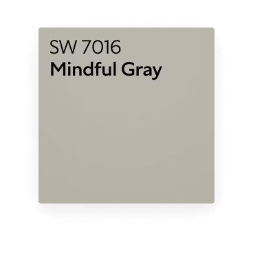
The best of the gray variations is Mindful Gray, a slightly more mellow version than the warmer grays available. If you’re on the hunt for a sophisticated greige with a bit of depth, it’s ideal.
Undertones:
Mindful Gray has a slight green undertone that isn’t overpowering, but adds a calming effect to your room. This is cooler than some other greiges, and is a good choice for spaces that have a lot of natural light.
Best For:
Bathrooms, kitchens, offices. Because of its neutral but cool undertone, it works well in spaces in which a more tranquil, more modern vibe is desired.
Why You’ll Love It:
This Mindful Gray is a quiet, understated color — a contemporary and fresh color. It gives depth without being too bold, which makes it great in spaces where you want to set the mood but not overwhelm the space. It’s ideal for those who want a little bit of coolness along with warmth.
6. Balanced Beige (SW 7037): The Earthy Choice
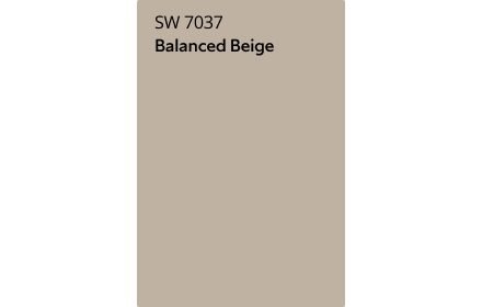
Balanced Beige is a darker, earthier greige, that looks rich and warm. This one is a great greige if you’re looking for a bit more character and warmth.
Undertones:
Balanced Beige has a warm beige undertone that’s natural and earthy, but grounded and calming. It’s has a touch of a subtle gray element that keeps it from feeling too yellow or orange.
Best For:
Wherever you want to create that warm, relaxed, cozy area; living room, library etc. It blends and suits particularly nicely with natural textures, such as stone, wood and leather.
Why You’ll Love It:
Balanced Beige is a perfect colour for a cozy, earthy atmosphere of your home. It has that timeless and comforting feel to it, while at the same time being rich enough to help your space feel sophisticated but approachable.
7. Colonnade Gray (SW 7641): The Light Sophisticate

Colonnade Gray is a light, cool greige that leans a bit grey but not too far so that it feels like a cold color. It’s a sophisticated, light airy color that’s not too bold.
Undertones:
Subtle green undertones in Colonnade Gray give a fresh look to a space. The slight green softens the coolness of the gray, making it sophisticated, but calming.
Best For:
Hallways, foyers, and light filled rooms where you don’t want the space to feel too closed in. It’s also a good choice for bedrooms or bathrooms that want a soft, tranquil backdrop.
Why You’ll Love It:
Those who love light, airy neutrals but don’t want pure white will love Colonnade Gray. It is sophisticated without being heavy, and is obviously perfect for adding a touch of relaxation and elegance.
8. Dorian Gray (SW 7017): The Bold Greige

Dorian Gray is your go to if you want a greige that adds depth and drama. This deep, rich shade is a more sophisticated alternative to lighter greiges, yet it’s not so bold it’ll overwhelm the room.
Undertones:
Dorian Gray has strong cool blue undertones that make it feel cool and a little moody. In rooms where you simply want to make a space cozy and introspective, the blue undertones, though subtle, are easy to see and therefore a good choice.
Best For:
Dining rooms or libraries, accent walls in living rooms or bedrooms, formal spaces. It’s perfect for creating a cozy, dramatic feeling that’s still neutral and sophisticated.
Why You’ll Love It:
Dorian Gray is bold but not overpowering. The depth and drama it provides to your space makes it great for spaces you want to be more sophisticated, while cozy at the same time. Dorian Gray is the greige you are looking for if you want a greige with more personality.
Conclusion: How to Find the Right Greige for Your Space
Sherwin Williams’ greige paint color range has something for every type of space and design preference. Either you prefer the Agreeable Gray, which is warm and friendly, or the Mindful Gray, which is feelin’ the cool sophistication, there’s a greige for you just waiting to call your home its own. Also one needs to remember that lighting can make all the difference in how greige looks in your space, so take the time to test out samples and see how the color looks at various times of the day. It doesn’t matter which one you pick, these greige colors will give you a timeless, neutral backdrop that will complement your home’s beauty